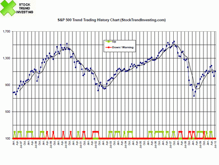
S&P 500 Trend Investing History Chart - August 2010
Every month, Stock Trend Investing is publishing here one of its history charts for trend investing and trading. This month, this is the history chart for the S&P 500 index.

Find here the monthly updated Trend Signals for the
S&P 500. It's free.
The trend investing approach (this is a long-term stock investing approach) has worked very well for us and therefore we are sharing our experiences and charts here. In the chart, the blue line shows the closing price of the S&P 500 index for that month.
The green line signals when our Initial Trend Expectation for the S&P 500 was "Up". The red line signals when our Initial Trend Expectation for the S&P 500 was "Down" or when there was a special warning.
We update these charts every month, providing every month the analysis on the basis of which we decide to increase, decrease or hold our own investments in index funds.
Currently (after the closing of July 2010), the S&P 500 does not show a clear trend in any direction. To draw conclusions for the overall US market, one would have to look at the current trends for the other US market indices as well.
Click here to see the trend investing charts that we have published previously.
Know the Trends
Sign up here for the free trend investing email newsletter.
Next & Previous Blog Post
- ‹ previous
- 44 of 174
- next ›


