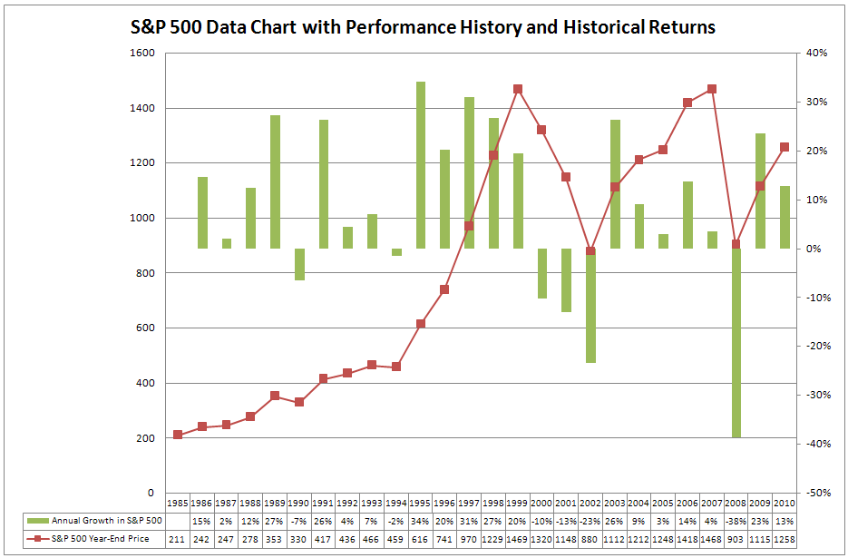
SP500 Data Chart

In January 2000, I took a good look at the SP500 data chart. The conclusion was obvious. I had to start investing in the stock market. My salary was fine but everyone around me was making a fortune more in the stock market.
Standing idle was no longer an option for me and I started to invest my savings in the stock market. That did not turn out well as you can see in the chart. The SP500 data shows for the year 2000 a result of minus 10%.
The SP500 data in the chart above shows also that during 1990 and 1994, the SP500 turned negative and that these years were followed by years with excellent results. With this data in mind, I had nothing to fear. Reality proved me wrong.
What I did learn from the SP500 Data Chart
The mistake I made in those days was that I just looked at the historical data chart of the SP500. What I did not do then was to analyze on a regular basis the data for the actual direction of the trend in the SP500.
Today I know better. Every month I review a number of Trend Signals for that SP500 that tell me the long-term trend direction. These signals told me to sell my index funds and mutual funds at the end of 2007 and to buy them back in the first half of 2009.
Click here to find the latest updated Trend Signals for the S&P 500 that are working well for me.
You will get instantly an overview of what the different indicators tell you about the long-term trend direction for the S&P 500 at this moment. Having objective measures to observe the current trend in the S&P 500 can help also you to improve the results of your investments.

